Your font choice is killing your t-shirt sales. Not your design skills. Not your niche selection. The font.
We see it every single day. POD sellers spend hours perfecting a design concept, nail the trending topic, pick the right colors, then slap on whatever font Canva suggests first. The result? A listing that gets scrolled past because the typography screams "amateur."
The best fonts for t-shirts are not the fanciest ones. They are the most readable ones. That single truth separates sellers who move 50 units a month from sellers stuck at 2.
What Are the Best Fonts for T-Shirts?
The best fonts for t-shirts share three qualities: they are bold enough to read on fabric, simple enough to process in under two seconds, and versatile enough to work on both light and dark shirts.
This matters more than most sellers realize. Your design appears as a tiny thumbnail on Amazon or Redbubble before anyone clicks. If the text is illegible at that size, you have already lost the sale.
We have tested hundreds of t shirt font styles across thousands of listings. The fonts below are the ones that consistently convert. Not the trendiest. Not the most artistic. The ones that actually sell.
The Top 10 T-Shirt Fonts That Actually Sell
Here are the fonts for t shirt design that our team recommends based on real sales data and years of POD experience.
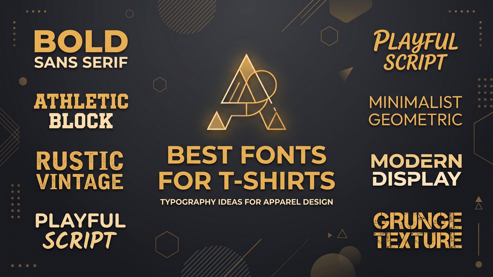
Bold, proven t shirt fonts dominate sales charts for a reason. They work across niches, platforms, and shirt colors without requiring design expertise.
Sans-Serif Powerhouses
- Helvetica Bold - The undisputed king. Clean, professional, works everywhere. If you only learn one font, make it this one.
- Montserrat - Free on Google Fonts. Geometric, modern, and incredibly versatile. Our top recommendation for new sellers.
- Futura Bold - Punchy and geometric. Perfect for motivational quotes and bold statements.
- Bebas Neue - Tall, condensed, and impossible to ignore. Ideal for single-word or short-phrase designs.
- Oswald - Another free Google Fonts winner. Condensed sans-serif that fits more text without sacrificing readability.
- Poppins - Rounded, friendly, and modern. Excellent for family-oriented and lifestyle niches.
Serif and Display Fonts
- Playfair Display - Elegant serif with high contrast. The best choice for vintage, wine, literary, and upscale niches.
- Anton - Ultra-bold display font that demands attention. Great for sports, fitness, and high-energy designs.
- Permanent Marker - Handwritten feel without the illegibility. Perfect for humor and casual designs.
- Lobster - Script-style but still readable. Use sparingly for accent text, never for full sentences.
Every single font on this list is available for free commercial use. No licensing headaches. No legal gray areas.
Stop Uploading Manually. Start Scaling.
Join 150,000+ sellers using Merch Titans Automation. Upload 100 designs in under an hour with AI-powered SEO and a built-in trademark engine that keeps your account safe.
Get Started Today →14-day money-back guarantee · Used by 150,000+ sellers since 2018
Best T-Shirt Fonts by Niche
Different niches demand different t shirt font styles. Here is exactly what to use for the most profitable POD categories.
Matching your font to your niche is the fastest way to increase perceived value and click-through rates.
Funny and Humor Designs
- Primary: Bebas Neue or Impact
- Secondary: Permanent Marker
- Keep it bold. Humor text needs to hit instantly. Buyers are scrolling fast and your punchline has about one second to land. Thin or decorative fonts bury the joke.
Motivational and Inspirational
- Primary: Montserrat Bold or Futura Bold
- Secondary: Playfair Display for contrast
- Clean and powerful. No script fonts here. Motivational buyers want authority and clarity. A strong geometric sans-serif communicates confidence better than anything cursive ever could.
Vintage and Retro
- Primary: Playfair Display or Abril Fatface
- Secondary: Oswald for supporting text
- Serif fonts earn their place in this niche. The high contrast strokes of Playfair Display evoke nostalgia and craftsmanship. Pair with a condensed sans-serif subtitle for a classic poster feel.
Sports and Fitness
- Primary: Anton or Bebas Neue
- Secondary: Oswald
- Condensed, aggressive, high-energy. These fonts communicate intensity and movement even when standing still. Perfect for gym quotes, team pride, and athletic motivation.
Family and Lifestyle
- Primary: Poppins or Raleway
- Secondary: Montserrat
- Rounded, warm, approachable. Family buyers respond to typography that feels friendly and safe. Avoid anything aggressive or edgy in this niche.
When you are designing t-shirts for print on demand, niche-appropriate typography does more heavy lifting than most sellers give it credit for. Use our free tools to research which niches are trending before you commit to a font direction.
Font Pairing Combinations That Convert
Using two fonts together is an art. Bad pairings look chaotic. Great pairings look professional and expensive.
The rule is simple: pair a bold display font with a clean, quiet companion. Contrast creates hierarchy. Hierarchy creates readability. Readability creates sales.
Here are five proven font pairings for t-shirt designs:
| Headline Font | Supporting Font | Best For |
|---|---|---|
| Bebas Neue | Montserrat | Humor, quotes, bold statements |
| Playfair Display | Oswald | Vintage, literary, upscale |
| Anton | Poppins | Sports, fitness, energy |
| Futura Bold | Raleway Light | Motivational, clean modern |
| Permanent Marker | Montserrat | Casual, hand-drawn aesthetic |
The key mistake sellers make? Using two fonts from the same family. Two sans-serifs together look like a mistake. Two serifs together look cluttered. Always cross categories when pairing.
Another common error is pairing fonts with similar x-heights and stroke widths. The whole point of using two fonts is creating visual contrast. If both fonts look roughly the same at a glance, you have wasted an opportunity to guide the buyer's eye through your design. Pick one loud font and one quiet font. That tension is what makes great typography work.
You can test these pairings quickly using Canva for your print on demand designs. Start with our recommended pairs and adjust from there.
Want to do this yourself? Merch Titans automates the entire process.
Stop Using Fancy Fonts (The Contrarian Truth)
Here is the uncomfortable reality most typography guides will not tell you: fancy fonts are sales killers on t-shirts.
Script fonts. Decorative fonts. That beautiful calligraphy font you found on a design blog. They look incredible on a desktop monitor at 100% zoom. They look like illegible squiggles on a t-shirt listing thumbnail.
We have A/B tested this repeatedly. Simple, bold typography outsells decorative typography by 3-4x in nearly every niche. The only exception is wedding and bridal niches, where script fonts are expected and buyers already know what the text says.
Think about where your design actually lives. It is a 150x150 pixel thumbnail on a search results page. At that size, your gorgeous hand-lettered script font becomes an unreadable smear. Bold sans-serif text at that same size? Crystal clear. The marketplace rewards clarity, not artistry.
The POD sellers making real money are not typography artists. They are using Helvetica, Montserrat, and Bebas Neue on repeat. Boring? Maybe. Profitable? Absolutely.
Stop trying to impress other designers. Start trying to get buyers to click.
Typography Rules Every POD Seller Must Follow
Beyond choosing the right t shirt fonts, how you use them determines whether your design converts or gets buried.
These rules are non-negotiable for anyone serious about t-shirt sales.
Size and Weight
- Minimum font weight: Regular (400). Preferably Bold (700) or heavier.
- If the text is not readable from 5 feet away on a physical shirt, it will not be readable as a thumbnail online.
- Thin and light font weights are for web design, not for apparel.
Color Contrast
- White text on dark shirts. Black text on light shirts. This is not the place to get creative.
- If you must use colored text, test it against both the shirt color and the marketplace background.
- Remember your design competes against hundreds of other thumbnails. Maximum contrast wins.
Spacing and Layout
- Increase letter spacing (tracking) by 5-10% from the default. Fabric printing slightly compresses text.
- Line height should be generous. Cramped text looks cheap.
- Center alignment works 90% of the time on t-shirts. Left alignment rarely looks right on apparel.
Commercial Licensing
- Google Fonts - 100% free for commercial use. Our primary recommendation.
- Adobe Fonts - Included with any Adobe subscription. Massive library.
- Font Squirrel - Curated collection of free commercial-use fonts.
- Always verify the license before uploading to any POD platform. "Free for personal use" does not mean "free for selling on Amazon Merch."
If you are using AI to generate your t-shirt designs, pay extra attention to the fonts the AI selects. Most AI tools default to system fonts that may have licensing restrictions.
Merch Titans Automation
Scale Your POD Business Faster
Research keywords, track trends, and optimize listings with our full toolkit.
14-day money-back guarantee · No contracts · Cancel anytime
How to Test Your Font Choices Before Publishing
Do not publish a single listing without running these three tests. They take 60 seconds and save you from wasting upload slots.
The thumbnail test is the single most important quality check you can do before publishing.
The Thumbnail Test
Shrink your design to 200x200 pixels. Can you still read every word? If not, your font is too thin, too decorative, or too small. Fix it before uploading.
The Squint Test
Step back from your monitor and squint at the design. If any word becomes unreadable, buyers scrolling quickly will not read it either.
The Five-Second Test
Show the design to someone for five seconds, then take it away. Ask them what it said. If they cannot repeat the text accurately, your typography needs work.
The Dark/Light Shirt Test
Always preview your design on both a black and white shirt background. Some fonts that look stunning on dark shirts completely fall apart on light ones, and vice versa. Your listing may appear on either color depending on the variant, so the font must perform on both.
Use our Amazon keyword research tool to validate that your text-based design targets phrases people actually search for. The best typography in the world will not save a design with zero search demand.
Scaling Your Font-Based Designs With Merch Titans
Once you have locked in your go-to fonts, the next step is scaling production without sacrificing quality.
Systemizing your font choices turns design from a creative bottleneck into a repeatable production line.
Build a curated font library of 5-7 fonts maximum. Assign each one to specific niches. Create templates in your design tool with these fonts pre-loaded. Then focus your energy on what actually varies: the text content and niche targeting.
This is where Merch Titans becomes essential. Our platform helps you research trending keywords, analyze competition, and find profitable niches at $29.99/mo (billed annually) or $39.99/mo. Combine that data with your curated font library and you have a system that produces winning designs consistently.
Pair our research tools with MyDesigns for managing and uploading your designs at scale. The sellers who treat POD like a system, not a hobby, are the ones hitting four and five figures monthly.
Want to do this yourself? Merch Titans automates the entire process.
FAQ
What is the most popular font for t-shirts?
Helvetica Bold is the single most popular font for t-shirts across all niches. Its clean lines, excellent readability at any size, and universal appeal make it the default choice for POD sellers who want maximum sales potential.
Can I use Google Fonts for commercial t-shirt designs?
Yes. Every font on Google Fonts is licensed under the SIL Open Font License, which explicitly allows commercial use including print on demand products. You can use them freely on Amazon Merch, Redbubble, and any other POD platform without paying licensing fees.
How many fonts should I use on one t-shirt design?
Stick to two fonts maximum per design. One for the headline and one for supporting text. Using three or more fonts creates visual chaos that kills readability and drives buyers away. The best-selling t-shirt designs almost always use just one or two fonts.
What fonts should I avoid for t-shirt designs?
Avoid Comic Sans, Papyrus, Curlz MT, and any font that requires squinting to read. Also avoid ultra-thin fonts because they disappear on fabric. If a font looks good at 12px on screen but becomes unreadable at arm's length, skip it entirely.
Do serif or sans-serif fonts sell better on t-shirts?
Sans-serif fonts outsell serif fonts on t-shirts by a wide margin. Sans-serif fonts like Helvetica, Futura, and Montserrat maintain readability on fabric better than serif fonts. The exception is vintage and retro niches, where serif fonts like Playfair Display perform extremely well.
Typography is not a creative decision on t-shirts. It is a business decision. Pick readable fonts. Pair them intentionally. Test ruthlessly. The sellers who treat fonts as a conversion variable, not a design preference, are the ones building real POD businesses.
Your next bestseller probably uses Montserrat Bold on a black tee. Stop overthinking typography. Start shipping designs that sell. Go make it.