Color is the first thing a buyer processes in your design. Before they read the text, before they notice the composition, their brain reacts to the colors. That reaction determines whether they keep scrolling or click.
Understanding color theory for t-shirt design isn't about becoming an art school graduate. It's about making deliberate choices that make your designs look professional, print correctly, and appeal to buyers emotionally. Here's what actually matters.
What Is Color Theory for T-Shirt Design?
Traditional color theory covers the color wheel, color relationships (complementary, analogous, triadic), and color mixing. Applied to t-shirt design specifically, it also means understanding:
- How fabric color interacts with ink color
- How colors shift between screen and print
- Which combinations signal different buyer demographics
- How contrast affects design readability at thumbnail size
Most design guides stop at the color wheel. We're going further.
The Color Wheel Basics Every Designer Needs
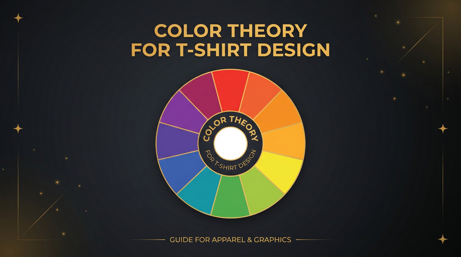
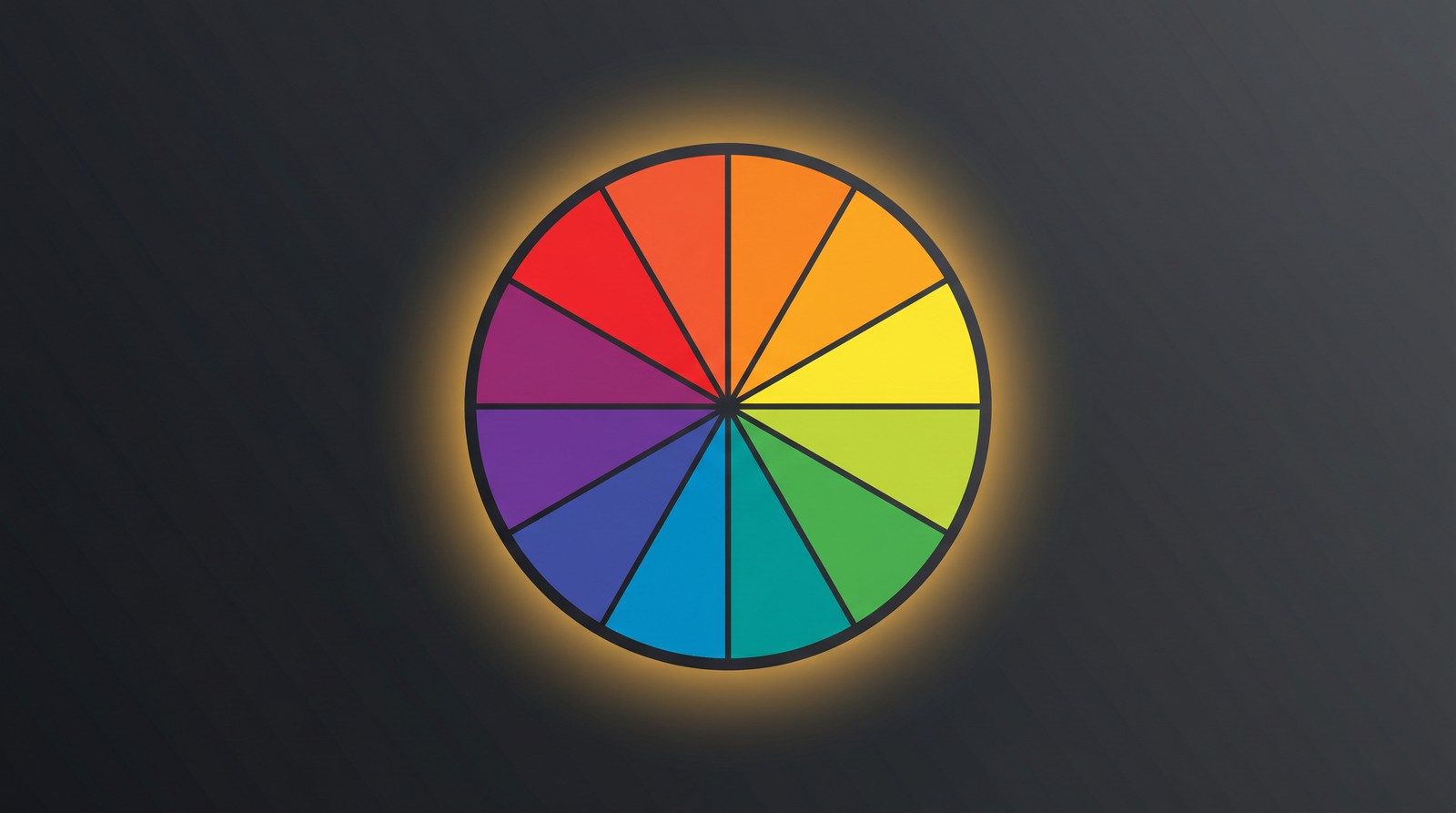
The color wheel is divided into primary colors (red, blue, yellow), secondary colors (orange, green, purple), and tertiary colors (the mixes in between). Every color relationship worth knowing for t-shirt design flows from this foundation.
The Four Useful Color Schemes
Complementary: Colors opposite on the wheel. High contrast, high energy. Red/green, blue/orange, purple/yellow. Powerful but needs careful balance - use one as dominant (70%), one as accent (30%).
Analogous: Colors adjacent on the wheel. Low contrast, harmonious. Orange/yellow/red feels warm. Blue/green/teal feels cool and calm. Great for nature-themed or lifestyle designs.
Triadic: Three colors equally spaced on the wheel. Red/blue/yellow or orange/green/purple. More complex but can look vibrant if handled well. Limit triadic schemes to 2-4 total design colors.
Split-complementary: A base color plus the two colors on either side of its complement. More nuanced than pure complementary but still high contrast. Good for avoiding the "Christmas colors" trap of pure red/green.
The practical rule: If you can't name the color scheme you're using, you're not using one.
Designing for Dark vs. Light Shirts
This is where most beginner designers make their biggest mistake. They design on a white canvas and then slap the design on a black shirt template. The results are usually muddy, inconsistent, or visually wrong.
Start your design on the shirt color it's intended for.
Dark Shirts: The Default Winner
Dark shirts - black, navy, dark heather gray, dark green - outsell light shirts in nearly every print-on-demand niche. Buyers prefer them for casual wear, they show wear less obviously, and they provide the most dramatic contrast for bold designs.
For dark shirts, use:
- White as the base "ink" color for maximum contrast
- Off-white or cream for a softer, vintage feel
- Bright, saturated accent colors (coral, teal, bright gold) against white base elements
- Avoid light pastel colors - they wash out against dark fabrics in DTG printing
Light Shirts: When They Win
White and light gray shirts perform strongly in specific contexts: watercolor art prints, feminine lifestyle designs, colorful full-coverage graphics, and product-focused illustrations.
For light shirts, avoid:
- White or near-white elements (they disappear)
- Very dark backgrounds in your design (creates an unwanted "box" around your art)
- Very light colors with thin strokes (thin lines in light colors on white shirts are nearly invisible)
Color Psychology in T-Shirt Design
Color psychology describes how colors trigger emotional and psychological responses in viewers. In apparel, these associations influence what buyers feel when they see your design - and whether it fits the identity they want to project.
What Colors Signal to Buyers
Red: Energy, urgency, passion, power. Works for athletic designs, bold statements, holiday themes. Overused in sale messaging so use sparingly for genuinely impactful moments.
Blue: Trust, stability, calm, professionalism. Universally appealing. Works across demographics. Navy is the most versatile color in apparel because it reads as classic and dependable.
Black: Sophistication, authority, mystery, premium. The most popular shirt color for a reason. Black garments project a premium feel that lighter colors don't match.
Green: Nature, health, growth, organic. Perfect for outdoor, environmental, and wellness themes. Olive green has strong appeal in streetwear-adjacent aesthetics.
Yellow/Gold: Optimism, energy, warmth. Works well as an accent color rather than a dominant one. Gold specifically signals achievement and is strong for milestone or professional designs.
Purple: Creativity, spirituality, royalty. Popular in witchy/mystical niches, LGBTQ+ adjacent designs, and spiritual/yoga content.
Orange: Enthusiasm, warmth, accessibility. Often underused. Works beautifully against dark navy or charcoal in designs targeting outdoor, adventure, and craft beer niches.
Matching Color to Niche Demographics
Different buyer demographics have distinct color preferences:
- Women 25-44: Dusty rose, sage green, burgundy, warm neutrals
- Men 18-35: Black, charcoal, navy, forest green, rust
- Kids/Parents: Bright primaries, pastels, rainbow palettes
- Outdoor/Adventure: Earthy tones, olive, burnt orange, forest green
- Professional/Corporate humor: Black, navy, white, minimal palette
Want to do this yourself? Merch Titans automates the entire process.
Contrast: The Technical Standard That Determines Readability
Contrast is the most important practical consideration in t-shirt color selection. A design with poor contrast looks great on your monitor and terrible in someone's closet photo.
Contrast Ratio Rules for Apparel
Use this simple rubric: hold your design at arm's length and squint. If text and key elements are still readable, your contrast is sufficient. If elements blend together or become illegible, you need more contrast.
The technical standard: WCAG 2.1 accessibility guidelines recommend a contrast ratio of at least 4.5:1 for normal text. While this is a web standard, it applies usefully to apparel text readability.
For practical purposes:
- Black on white: 21:1 contrast. Maximum readability.
- White on black: 21:1 contrast. Maximum readability.
- White on navy: 15:1. Excellent.
- Yellow on white: 1.1:1. Essentially illegible. Avoid.
- Gray on white: Highly variable. Test every combination specifically.
The Three-Distance Test
Before finalizing any design:
- Close (arm's length): Can you read all text clearly?
- Mid-range (3 feet): Do the primary elements remain readable?
- Thumbnail (simulate Etsy/Amazon search result size): Does the design read as a coherent image or a blurry mess?
Most designs that perform poorly in search fail the thumbnail test. They look fine at full size and completely unclear at 150px.
Printing Considerations That Change Everything
Color theory for print-on-demand requires understanding how different printing processes affect color reproduction.
DTG (Direct-to-Garment) Printing
DTG printing - used by most POD platforms including Amazon Merch - sprays ink directly onto fabric. Key considerations:
- Bright colors on dark shirts require an underbase: A white ink layer is printed first, then colors on top. This adds slight texture to bright colors on dark shirts.
- Pure white on dark shirts often looks slightly off-white due to the underbase - this is normal
- Very dark colors on light shirts can appear slightly lighter due to fabric bleed
- Gradients work but can look banded at certain color transition points - test before scaling
Screen Printing (for custom orders)
Screen printing uses spot colors - one color per screen. This makes exact color matching easier but limits gradients. If you're designing for screen printing contexts:
- Keep designs to 4 colors maximum
- Avoid gradients entirely
- Think in solid, separated color areas
Color Mode: RGB vs. CMYK
Design in sRGB color space for most POD platforms. Platforms convert to their print profiles during production. CMYK profiles can cause unexpected color shifts when uploaded to DTG-based platforms.
Amazon Merch, Redbubble, and Printful all accept sRGB files and apply their own CMYK conversion. Trust their process.
Building a Signature Color Palette for Your POD Brand
Top-performing POD shops don't reinvent their color strategy for every design. They build a signature palette - typically 6-8 colors - and work within it consistently.
This serves two purposes:
- Speed: Decisions are already made. You execute instead of deliberating.
- Brand cohesion: Buyers who see multiple designs in your shop recognize a consistent aesthetic, which builds trust and repeat purchase behavior.
Building Your Palette
Start with your niche demographic's color preferences (see the section above). Then:
- Choose 1-2 neutrals (black, white, cream, charcoal, or dark navy)
- Choose 2-3 core brand colors that fit your niche
- Choose 1-2 accent colors that complement the core palette
- Test every combination for contrast at thumbnail size
Lock these into a Canva palette, a Photoshop swatch file, or a simple PDF reference sheet. Refer to it for every design.
Merch Titans Automation
Design Smarter and Upload Faster With Merch Titans
Our platform helps you scale from concept to live listing on Amazon Merch, Etsy, and more - with bulk tools that actually save time.
14-day money-back guarantee · No contracts · Cancel anytime
The Colors That Consistently Convert on POD Platforms
Based on consistent patterns across Amazon Merch, Redbubble, and Etsy bestseller data:
Black shirt + white design: The highest-volume combination across virtually every niche. Timeless, readable, reliable.
Navy shirt + white/cream design: Strong performer in outdoor, professional, and vintage niches. Slightly softer than pure black.
Black shirt + gold/amber accents: Premium feel. Works exceptionally in anniversary, milestone, professional, and achievement-themed designs.
White shirt + bold illustrated color: Best for art prints, colorful character designs, and vibrant lifestyle imagery.
Dark heather gray + white: More casual feel than black. Strong in humor, lifestyle, and everyday-wear niches.
One observation worth making: the sellers who overthink color theory often produce less than those who master one reliable combination and execute it consistently. Start with black-on-white. Learn what converts. Expand your palette based on data.
For more on designing for specific platforms, check out our guide on how to design t-shirts for print on demand and our breakdown of the best t-shirt design software for POD sellers.
Color theory gives you the vocabulary. Consistent execution gives you the results.
Frequently Asked Questions
What colors work best for t-shirt designs?
High-contrast color combinations with a maximum of 3-4 colors work best for t-shirt designs. White, off-white, and bright accent colors on dark shirt backgrounds consistently outperform complex multi-color designs in both print quality and sales conversion.
How does color theory apply to print on demand t-shirts?
Color theory applies to print on demand by guiding which design colors will look intentional, readable, and appealing after printing. Contrast between design and shirt color determines readability, while color harmony determines whether the design looks professional or amateurish.
What are the most popular t-shirt colors for print on demand?
Black is the most-purchased t-shirt color across Amazon Merch, Redbubble, and Etsy POD categories, followed by navy and dark heather. White shirts perform well for full-color graphic designs. Dark shirts outsell light shirts roughly 3-to-1 in most niches.
Should I limit colors in my t-shirt designs?
Limiting to 2-4 colors produces better results for most print on demand designs. Complex multi-color gradients can look muddy after printing, and simpler color palettes tend to look more professional and intentional. Each additional color also increases print complexity.
How do I choose complementary colors for a t-shirt design?
Complementary colors sit opposite each other on the color wheel - blue and orange, red and green, purple and yellow. These pairs create strong visual contrast without clashing. For t-shirt design, use one color as dominant and the other as a smaller accent to avoid visual overload.