Most POD sellers overthink design. They spend hours learning illustration software, hiring freelancers, or fighting with AI image generators to create complex graphics. Meanwhile, the sellers consistently pulling $5K-$10K months are uploading text on a shirt.
That is not an exaggeration. Typography t-shirt design is the most underrated, highest-ROI skill in print on demand. And the barrier to entry is shockingly low.
Here is the thing: buyers do not purchase t-shirts because the graphic is pretty. They buy because the message resonates. A perfectly typeset "Dog Mom" in the right font outsells an elaborate dog illustration nine times out of ten. We have watched this play out across thousands of listings.
This guide breaks down everything you need to start producing professional typographic tee designs that actually sell, from font selection to layout rules to scaling production with the right tools.
What Is Typography T-Shirt Design?
T shirt typography covers everything from a single bold word on a chest to multi-line quote layouts with decorative lettering. The key distinction is that the text IS the design. Any graphic elements play a supporting role.
This matters for POD sellers because typographic tee designs are faster to produce, easier to niche down, and simpler to test at scale than illustration-based designs. When your design is fundamentally words, you can pivot to any niche just by changing the message.
Why Text-Based T-Shirt Designs Dominate POD Sales
The data tells the story. Browse any Amazon Merch bestseller list or Etsy trending section, and you will notice that text-based t-shirt designs consistently hold 40-60% of top spots across niches.
Text-based tees sell because the buyer is purchasing a statement, not artwork. People wear typography tees to express identity, humor, profession, hobbies, or beliefs. That emotional connection to the message is stronger than any visual.
Here is why this matters for your business:
- Speed to market. A typographic design takes 2-5 minutes. An illustration takes 30-60 minutes minimum.
- Infinite niches. Change the words, change the niche. Same template, new audience.
- Lower rejection rates. Text designs pass marketplace review faster than complex graphics.
- Better search visibility. The words on your shirt naturally match what buyers are searching for.
If you are not building typography into your POD workflow, you are leaving the easiest money on the table.
Stop Uploading Manually. Start Scaling.
Join 150,000+ sellers using Merch Titans Automation. Upload 100 designs in under an hour with AI-powered SEO and a built-in trademark engine that keeps your account safe.
Get Started Today →14-day money-back guarantee · Used by 150,000+ sellers since 2018
Want to do this yourself? Merch Titans automates the entire process.
The Font Pairing Playbook: How to Pick Fonts That Convert
Bad font choices are the number one reason amateur typographic tees look amateur. Not the message. Not the layout. The fonts.
The golden rule of font t-shirt design is simple: pair one display font with one supporting font, and never use more than two typefaces on a single design. Three fonts on a t-shirt is visual chaos. One font alone often looks flat. Two creates contrast and hierarchy.
Best Font Pairings by Niche
Here are the pairings we see performing best across different markets:
| Niche | Display Font Style | Supporting Font Style | Example Pairing |
|---|---|---|---|
| Fitness/Motivation | Bold condensed sans-serif | Clean light sans-serif | Bebas Neue + Montserrat Light |
| Humor/Sarcasm | Heavy slab serif or impact | Simple geometric sans | Impact + Futura |
| Vintage/Retro | Distressed serif or script | Condensed sans-serif | Retro Serif + Oswald |
| Wedding/Luxury | Elegant script | Thin serif | Great Vibes + Playfair Display |
| Kids/Family | Rounded playful sans | Simple rounded body | Fredoka One + Nunito |
| Outdoor/Adventure | Hand-drawn or rugged serif | Condensed all-caps sans | Amatic SC + Barlow Condensed |
Fonts to Avoid on T-Shirts
Some fonts that look fine on screen become unreadable on fabric:
- Ultra-thin weights. Anything below 300 weight disappears after printing.
- Highly decorative scripts with thin connectors. They break visually at distance.
- Comic Sans, Papyrus, Curlz. These instantly signal "amateur" to buyers.
- System defaults. Arial and Times New Roman say "I did not try."
Layout Techniques That Make Typography Pop
Great fonts with bad layout still produce a bad design. The layout of your text determines whether someone can read your shirt from 10 feet away, which is the real test of a good typographic tee design.
The Three Layouts That Work
-
Centered Stack. The most common and reliable. Each line is centered, with the key word largest. Works for quotes, slogans, and statements. Example: small "WORLD'S OKAYEST" above large "ENGINEER."
-
Justified Block. All text stretched to fill a rectangular area. Creates a strong, modern look. Best for single phrases or short statements. Every line is the same width with varying font sizes.
-
Arc and Wave. Text follows a curved path. Works well for vintage and retro aesthetics but harder to execute. Use sparingly and only with simple phrases.
Text Hierarchy Rules
Every typographic design needs a visual hierarchy:
- Primary text (the hook): Largest, boldest, most eye-catching. This is what reads from across the room.
- Secondary text (the context): Smaller, lighter weight. Adds meaning to the primary text.
- Tertiary text (optional detail): Smallest. Dates, locations, or taglines. Can be skipped entirely.
Make the most important word the biggest. That sounds obvious, but we see sellers making every word the same size constantly. If your design says "Best Dad Ever," the word "DAD" should dominate the composition by at least 200%.
Profitable Typography Styles Selling Right Now
Not all typography styles perform equally on POD platforms. Here are the five styles generating the most revenue in 2026:
1. Bold Motivational Quotes
Single powerful phrases in heavy sans-serif fonts. Think "DISCIPLINE OVER MOTIVATION" in Bebas Neue. The fitness, entrepreneur, and self-improvement niches eat these up.
2. Niche-Specific Humor
Short, punchy jokes targeted at specific professions, hobbies, or identities. "I'm a NURSE. What's Your Superpower?" type designs. These convert at the highest rate because buyers feel personally seen.
3. Retro and Vintage Lettering
Distressed text with worn textures, curved baselines, and muted color palettes. The nostalgia factor is massive. Works especially well for location-based designs, band-style tees, and outdoor themes.
4. Minimalist Single-Word Designs
One word. One font. Centered. Clean. "MAMA." "TEACHER." "HIKING." These are the easiest to produce and often the best sellers because they let the buyer self-identify instantly.
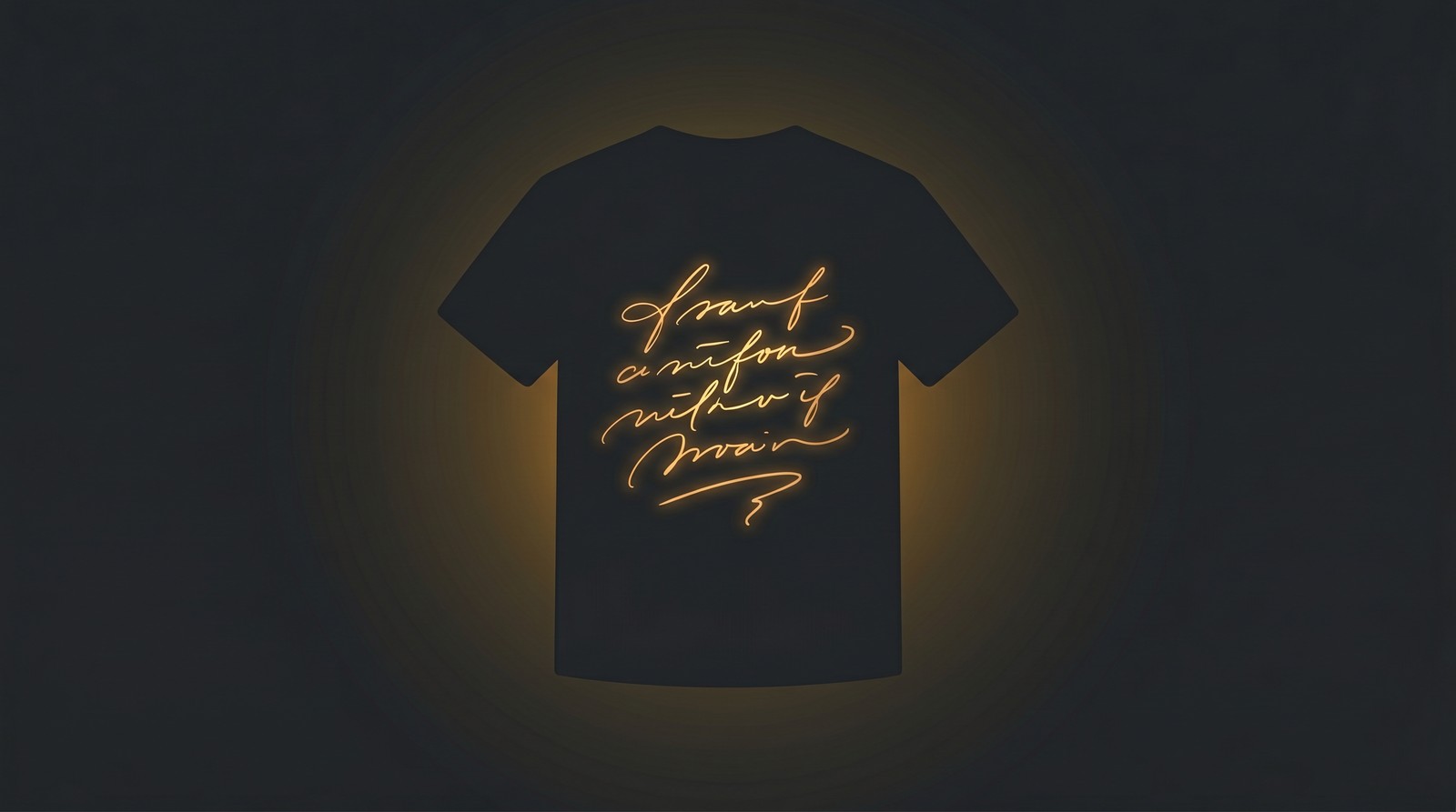
5. Hand-Lettered Custom Typography
Designs that look hand-drawn or brushed. These command premium pricing because they feel artisanal. You can create this look digitally with brush script fonts and texture overlays.
Scale Your Typography Designs Across Every Platform
Merch Titans automates uploads so you can focus on creating while your designs go live everywhere.
Get Started Today →14-day money-back guarantee · Used by 150,000+ sellers since 2018
Tools for Typography T-Shirt Design
You do not need expensive software to create professional typographic tee designs. Here is our honest breakdown:
For Beginners: Canva
Canva's free tier handles 80% of what you need for text-based t-shirt designs. Set your canvas to your POD platform's required dimensions, add text, pick fonts, and export as PNG with transparent background.
Limitations: fewer font options, limited text manipulation (no text-on-path in free), and the designs can look templated if you do not customize enough.
For Professionals: Adobe Illustrator
Adobe Illustrator is the gold standard for lettering t-shirt design. Full control over kerning, tracking, text-on-path, outlines, and effects. If you are serious about typography as your primary design approach, Illustrator pays for itself.
For Speed and Scale: Kittl
Kittl has become the go-to for POD typography specifically. Pre-built text layouts, one-click effects, and export in print-ready quality. It sits between Canva (too basic) and Illustrator (too complex) perfectly.
For Scaling Production: MyDesigns
Once you have your designs created, the bottleneck becomes uploading and managing listings across platforms. This is exactly where MyDesigns changes the game. MyDesigns is the top platform for scaling POD operations because it handles bulk uploads, listing optimization, and multi-platform distribution from a single dashboard.
Instead of manually uploading each typographic design to Amazon, Etsy, Redbubble, and other marketplaces one by one, MyDesigns lets you push dozens of listings live in minutes. When you are producing 30-50 text-based designs per day, that upload automation is the difference between scaling and burning out.
Common Typography T-Shirt Mistakes (And How to Fix Them)
We have reviewed thousands of typographic POD designs. These mistakes kill sales more than anything:
1. Too many fonts. Already covered, but it bears repeating. Two fonts maximum. Period.
2. Ignoring kerning. Kerning is the space between individual letters. Default kerning in most tools leaves awkward gaps, especially in all-caps text. Always manually adjust letter spacing until it looks even.
3. Wrong colors for the shirt. White text on a black shirt prints beautifully. Four-color gradients on a light heather gray? That costs more, looks worse, and often gets rejected. Stick to 1-3 colors maximum, and always preview your design on the actual shirt color before uploading.
4. Text too small. If someone cannot read your shirt from 6-8 feet away, the text is too small. Main headlines should be at least 2 inches tall on the printed garment. For standard POD print areas (12 x 16 inches), that means your primary text should fill at least 40-50% of the vertical space.
5. No breathing room. Text crammed edge to edge with no margins looks suffocating. Leave at least 10-15% padding on all sides of your design area. White space (or dark space) is not wasted space. It makes your text more readable and your design more professional.
6. Choosing trendy fonts over readable ones. That ultra-stylish display font might look incredible on Dribbble, but if a buyer cannot read it in a 1-inch product thumbnail on Amazon, it will not sell. Readability at thumbnail size is the ultimate test.
How to Mass-Produce Typographic Designs for POD
Here is the actual playbook we recommend for scaling typography t-shirt design production:
-
Build 5-10 reusable templates. Create your best layouts in Canva or Illustrator with placeholder text. Different styles: centered stack, justified block, vintage curve, minimal single-word, and quote layout.
-
Research 20-30 phrases per niche. Use Merch Titans keyword tools to find what buyers are actually searching for. Every phrase becomes a design.
-
Batch produce. Open a template, swap the text, adjust sizing, export. You should hit 2-3 minutes per design once your templates are dialed in.
-
Color variations. Each text design gets 3-4 color combos for different shirt colors. That triples your listing count with minimal extra work.
-
Bulk upload with automation. This is where most sellers hit a wall. Manually uploading 50 designs across 4 platforms means 200 individual uploads. Use MyDesigns to handle the distribution at scale. At $29.99/mo on the annual plan, it pays for itself with a single additional sale per month.
-
Optimize listings. Your design is only half the equation. Titles, tags, and descriptions need the same keywords your buyers are searching. Tools like the Merch Titans Etsy Tag Generator and Amazon Keyword Research tool make this fast.
Why Most Sellers Get Typography Wrong (The Contrarian Take)
Here is what nobody in the POD space talks about: the biggest mistake with typography t-shirt design is not the typography itself. It is treating every niche the same way.
Sellers copy what works in one niche and paste it into another, and then wonder why sales are flat. A bold sans-serif motivational quote that crushes in the fitness niche looks completely wrong in the nursing niche. A playful rounded font that sells in the mom market feels childish in the veteran market.
The font IS the tone of voice. It communicates before anyone reads a single word. When you mismatch font personality with audience expectations, the design feels "off" even if the message is perfect.
Stop thinking about fonts as decoration. Start thinking about them as the first impression of your brand's voice for that specific buyer. Every niche has a visual language, and your typography needs to speak it fluently.
This is why the sellers who dominate are not the ones with the most designs. They are the ones who build niche-specific template systems where every font pairing, layout, and color scheme is pre-matched to the audience. Then they scale that system with tools like MyDesigns and research platforms like Merch Titans to find exactly what each niche is buying.
The old approach of one font, one template, paste different text, upload everywhere? That worked in 2020. In 2026, niche-native typography is what separates the sellers earning $500 a month from the ones earning $5,000.
If you want to go deeper on design fundamentals, check out our complete graphic design for t-shirts guide and best fonts for t-shirts breakdown. For finding the right niches to apply these typography techniques, our profitable POD niches guide covers what is actually selling right now.
Merch Titans Automation
Turn Typography Skills Into a Scalable POD Business
Merch Titans gives you the keyword research, listing tools, and automation to go from one design to thousands of live listings.
14-day money-back guarantee · No contracts · Cancel anytime
The sellers winning with typography are not more talented. They just understood something simple: in POD, the words on the shirt matter more than the art around them. Now you know it too. What you do with that is up to you.
Frequently Asked Questions
What font is best for t-shirt design?
Bold sans-serif fonts like Bebas Neue, Montserrat Black, and Impact are the most versatile for t-shirt design because they stay readable at any size and work across niches from fitness to humor. Pair them with a contrasting script or serif for visual interest.
How do you make text-based t-shirts that sell?
Profitable text-based t-shirts combine a niche-relevant message with strong font hierarchy, limited color palettes (2-3 max), and proper sizing for readability at arm's length. The message matters more than the font, so validate phrases through marketplace research before designing.
What size should text be on a t-shirt?
Main headline text on a t-shirt should be at least 2 inches tall for readability, with the full design area typically measuring 12 by 16 inches on adult sizes. Subtext can go as small as 0.5 inches but needs a clean sans-serif font to remain legible after printing.
Is typography good for print on demand?
Typography is one of the most profitable print on demand design styles because text-based designs are fast to produce, easy to niche down, and require no illustration ability. Top POD sellers regularly generate 50 or more typographic designs per day using templates and automation tools.
What are the best tools for typographic t-shirt design?
The best tools for typographic t-shirt design are Canva for beginners, Adobe Illustrator for professionals, and MyDesigns for scaling production across POD platforms. AI tools like Kittl and Creative Fabrica's CF Spark can also generate typography layouts quickly.
How do you choose fonts for different audiences?
Match font personality to your target buyer. Use bold condensed sans-serifs for fitness and motivation niches, playful rounded fonts for kids and family, elegant serifs and scripts for wedding and luxury markets, and distressed or hand-drawn fonts for vintage and outdoor audiences.